Simple. Non-Technical. Less is More.
If you want your planned giving website to do more than just take up space – if you want it to actually communicate with your prospects and motivate them to plan a gift – here are the features to look for, and the ones to avoid:
- Your site should be customizable, not a cookie-cutter, take-it-or-leave-it product that looks and feels like the website of the nonprofit next door. You need to stand out, not blend in.
- Planned giving websites should be designed for maximum ease in navigation, following the cardinal rule, “Don’t make me think!”
- The design should be clean and lean, not burdened with heavy blocks of (yawn) text that will make the donor’s eyes glaze over.
- Planned giving websites should look contemporary and be mobile-friendly – no more early-90s hangovers!
- Your site should not be limited to dynamic content.
- It should host weekly tips for donors. (For instance: What gifts are the most popular? What are some donor benefits tied to specific gifts?)
- It shouldn’t link to the joke of the day, the stock market, medical tips for seniors, or any other superfluous stuff that distracts your prospect from learning about gift options and contacting you.
- And, planned giving websites shouldn’t have add-on tools that you think your prospects want, but that they don’t use – like complicated calculators. Don’t just simplify, over-simplify!
Our planned giving websites are the only ones that come out on the right side of all of these do’s and don’ts. And the best planned giving website feature of all? They are written, designed and developed for prospects first. (We did the heavy thinking, so your prospects won’t have to.)
Our websites are the premier planned giving marketing tools for the nonprofit organization that’s committed to staying ahead of the curve. They’re priced right, expertly created, and implementation is a breeze. Improving your program with our products will be the easiest decision you make this year … and possibly ever.
They’re not just donor-friendly. They’re simply, well, friendly.
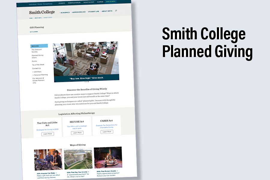
Don’t believe us? Check out the simple, elegant website we created for Smith College Planned Giving. Read About Sam Samuels, Director of Planned Giving, on the Zen of Planned Giving in Giving Tomorrow Magazine.
Category: Planned Giving Marketing


